
Double-Digit Conversion Rate Growth, Just By Reordering The Page
How User Research took the guesswork out of getting a 17% increase in AOV.
“Don’t make me think.”
That’s the title of a now-probably-quite-ancient book on web usability design. But it sums up my job perfectly. I’m in charge of (re)designing things so that customers have to think as little as possible to get what they want.
But how does one actually go about making customers think less?
Many companies choose option A:
Guessing.
Yup. That’s right. You’d be amazed at how far some companies will go to avoid getting real feedback from real people.
They’ll happily pay thousands of dollars for consultants to make assumptions about why their conversion rate is low. However they rarely consider the idea of paying the same amount to get real insights from customers.
I prefer option B:
Studying people.
I love to observe their actions. Ask them questions. Listen to their reactions. Then notice the differences between what they say and what they do.
For example, what do they do when they’re thinking of buying a crypto hardware wallet and they don’t know which one to choose? (A quest I recently accepted from one of my clients.)
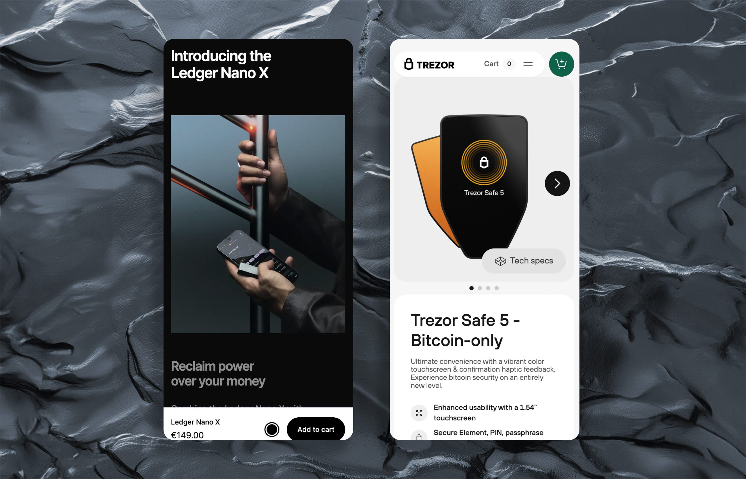
That’s why I’m sitting at my desk watching videos of people shopping on my client’s website, and not staring out the window at the sun rising over the mountains outside. Their revenue is over $200 million annually, and, naturally, they want to make even more. Thankfully for me, they know the value of optimizing design the right way.
You don’t need much money to run user research.
But you should definitely do user research if you want to make more money.
So here I am, watching recordings and taking notes on virtual post-its about everything these shoppers are saying about our site.
And, like they usually do, things just got interesting!
Every customer is reaching the same point in their journey and spouting identical complaints:
“There's NO WAY I could decide this is the product I wanted without more information so why would I then also be considering OTHER options. That was annoying.”
and
I'm not interested in seeing all these accessories when I've chosen to look a a particular product. Don't waste my time with irrelevant data.
I lean back on my chair, take a deep breath, and think to myself:
“…Perfect…😌”
This will solve a key debate between myself, and Chris, the Head of Growth.
When I wrap up the user research report and show the team the insights, they’re all in agreement: We need to experiment with demoting our accessories cross-sell.
So onto the AB testing roadmap it went.
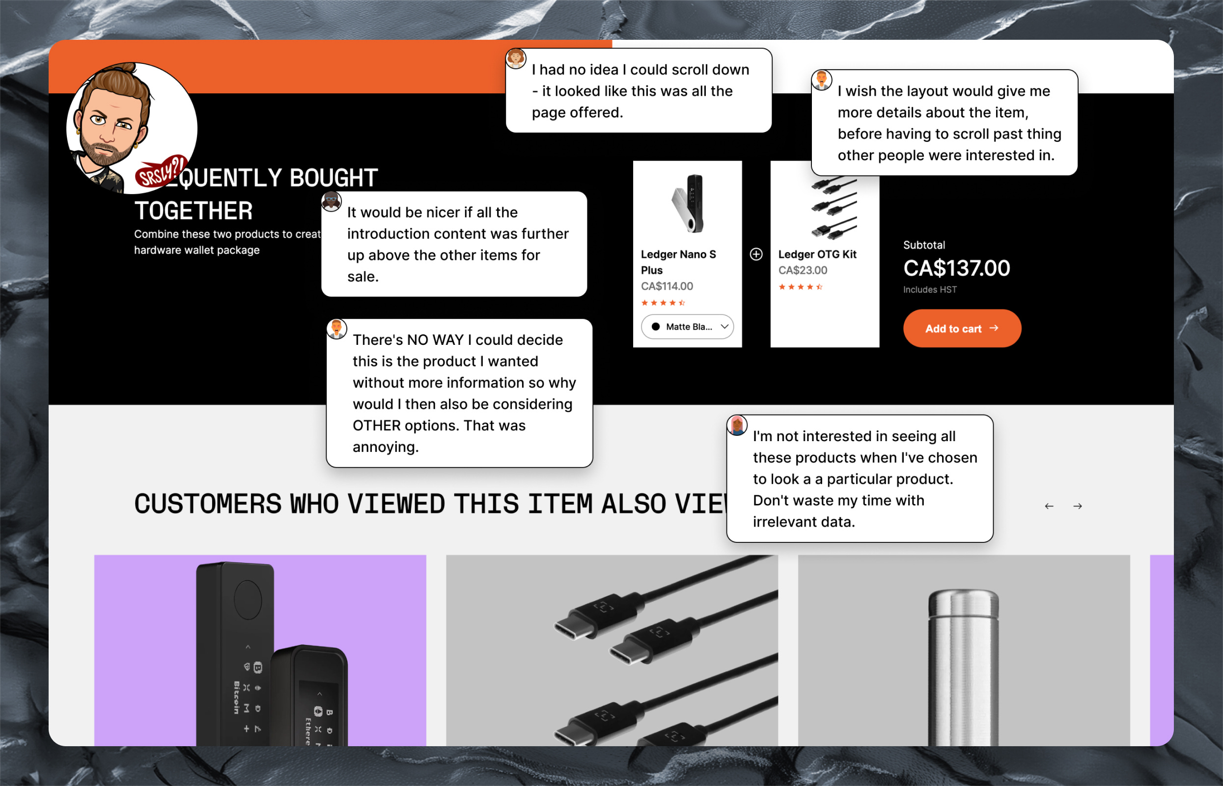
You see, Chris loves to push bundles on product pages. They’re paid to increase Average Order Value (AOV). They believe if we showcase bundled accessories with our hardware high up on the product page, we’ll increase the AOV of each customer, making us more money in the process. It’s a good theory.
Good…but flawed.
In reality, our upsell was failing in two ways.
It wasn’t a good deal for customers. With no discounts for buying multiple products, it was nothing more than a quick way to add two products to the cart at once.
It was obstructing customers from achieving their primary goal. They wanted more information about our hardware product, and we were busy trying to push an accessory on them before they were ready to purchase.
The best part is that it’s was an extremely easy test to run. We just move the cross-sell down the page, below the main product content.
So simple.
Maybe too simple?
Making money can’t be this easy can it?
Apparently, it can.
The results come in a few weeks later, and it was one of our most successful tests to date.
A 14.9% increase in conversion rate. (At 99% statistical confidence.)
Revenue per user was up 17% too.
That’s on a product that we sell 25-million-dollars-worth of each year.
Not bad for simply moving around a few boxes on a page.
And it highlights an important point.
Your content matters.
Your page order matters.
But most importantly, user research matters.