
Five Easy Design Changes That Will Inarguably Improve Your Website.
Because "accessible design" is just another way of saying "good design".
I met Liz in the French Alps.
She excels at most extreme sports, but more than anything else she loves to ski.
Or, she did.
Until she tore the tendons in her left knee. A skiing accident of course. Then, a few days later, she broke her right ankle falling off a ladder. I promise I’m not making this up.
Now she hobbles around on crutches.
The other day, I picked her up in my Fiat 500 and drove her up the mountain for a coffee. To a cafe on the hillside with a terrace overlooking the Chamonix valley.
For someone on crutches, it’s a bit of a walk from the parking lot to the cafe. But she’d been there a few weeks earlier and knew she could manage it.
We ambled across patches of melting snow from the parking lot to the first stairway.
At the foot of the stairs, she stopped.
She shuffled closer to the first step. Put one crutch up. Took it down. Put the other one up. Took that down too. Tried leaning on the handrail. Put the first crutch up again. Nope. Tried grabbing my shoulder. Still no.
“This wasn’t so difficult before! The snow was higher a few weeks ago.” she said to me.
We probably spent 5 minutes attempting that first move before we found a strategy that worked.
Liz is one of the lucky ones. In a few weeks she’d be free of her cast, and navigating that step would be easy for her again.
Not all disabilities are temporary.
Someone who’ll have to deal with problems like this forever is a man called Halli. (Pronounced sort of like Halle Berry, according to his website).
He’s one of my favourite Designers. A sharp, witty and amusingly self-deprecating Icelandic fellow. He ran a highly-acclaimed design agency called Ueno for seven years before it was acquired by Twitter.
He lives with a degenerative muscle disease called muscle atrophy, meaning he is slowly losing the strength in his body. It also means he lives in a wheelchair. He has been a positive force in both the design and accessibility communities.
And he’s obsessed with ramps.
Being in a wheelchair means that everyday tasks for you, me, and occasionally Liz are extremely difficult for Halli. Tasks like getting up a 5-inch step into a shop.
So a lot of the time he ends up sitting outside, alone.
One day, he looked at the doorway and thought:
“That one step separates me and my family”
So Halli started a fund. Called “Römpum upp Reykjavík” (“Let's ramp up Reykjavík”)
Their goal was to build 100 ramps in Iceland in one year. They did it in eight months. They’ve since built over 1,000.
Their goal is to increase the access of disabled people to services, shops and restaurants in Iceland. In doing so, those shops become more accessible to everybody. Nobody sits at the base of these new ramps wishing there was a step there instead.
I don’t design buildings anymore, but I believe the same is true for web design: Designing for accessibility benefits us all.
We even have guidelines for web accessibility.
They’re called the Web Content Accessibility Guidelines, or WCAG for short. Which is terrible branding. It hardly rolls off the tongue. Wuh-cag?
Designing for accessibility is now the law in many countries, including the US and Canada, yet I still meet people who see compliance as more of a nuisance than a blessing.
Until they get sued.
Then it becomes even more of a nuisance.
Pharmaceutical companies usually get a bad rep, but in all my years of work, the only company that ever demanded my team design for accessibility was AstraZeneca.
I think this is weird because when you build for accessibility, everybody wins.
Web accessibility requires you to think about both the visual design, and the code that powers it.
I’m not going to get into the engineering side today, because it’s not really my area of expertise, but here are five easy ways to make your designs more visually accessible.
1. Use High Contrast Text
Don’t make people squint at their screen. Good contrast improves readability for everyone. This is achieved through colour and size. Black text on a white background is easier to read than black text on grey background. Larger font sizes are easier to read than smaller ones. Remember, if your brand palette was designed for print, you made need to adjust some colours for the web.
You can test if your colour scheme passes contrast guidelines using tools like the A11y Figma Plugin or the Chrome Browser Inspector Tools.
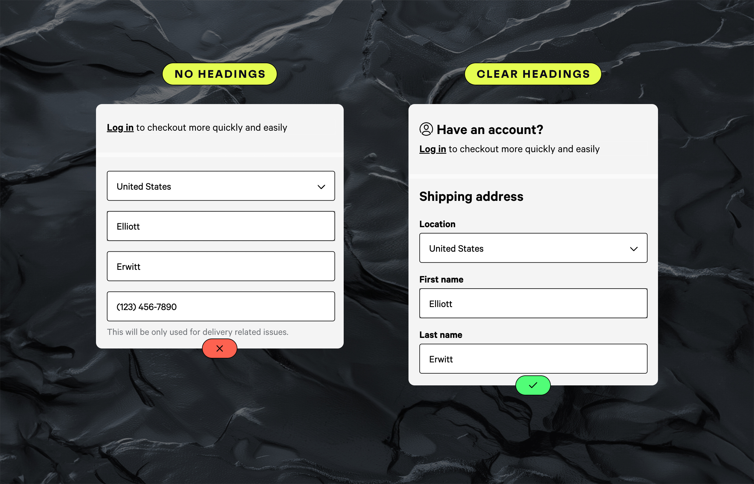
2. Use Clear Headings + Labels
Don’t make people guess where they are on your site. Headings guide people through your content, helping them quickly find what they’re looking for, and confirming that they’ve arrived where they expected to be. For people using screen readers, these headings aren’t just helpful, they’re essential. Prioritise being clear over being clever.
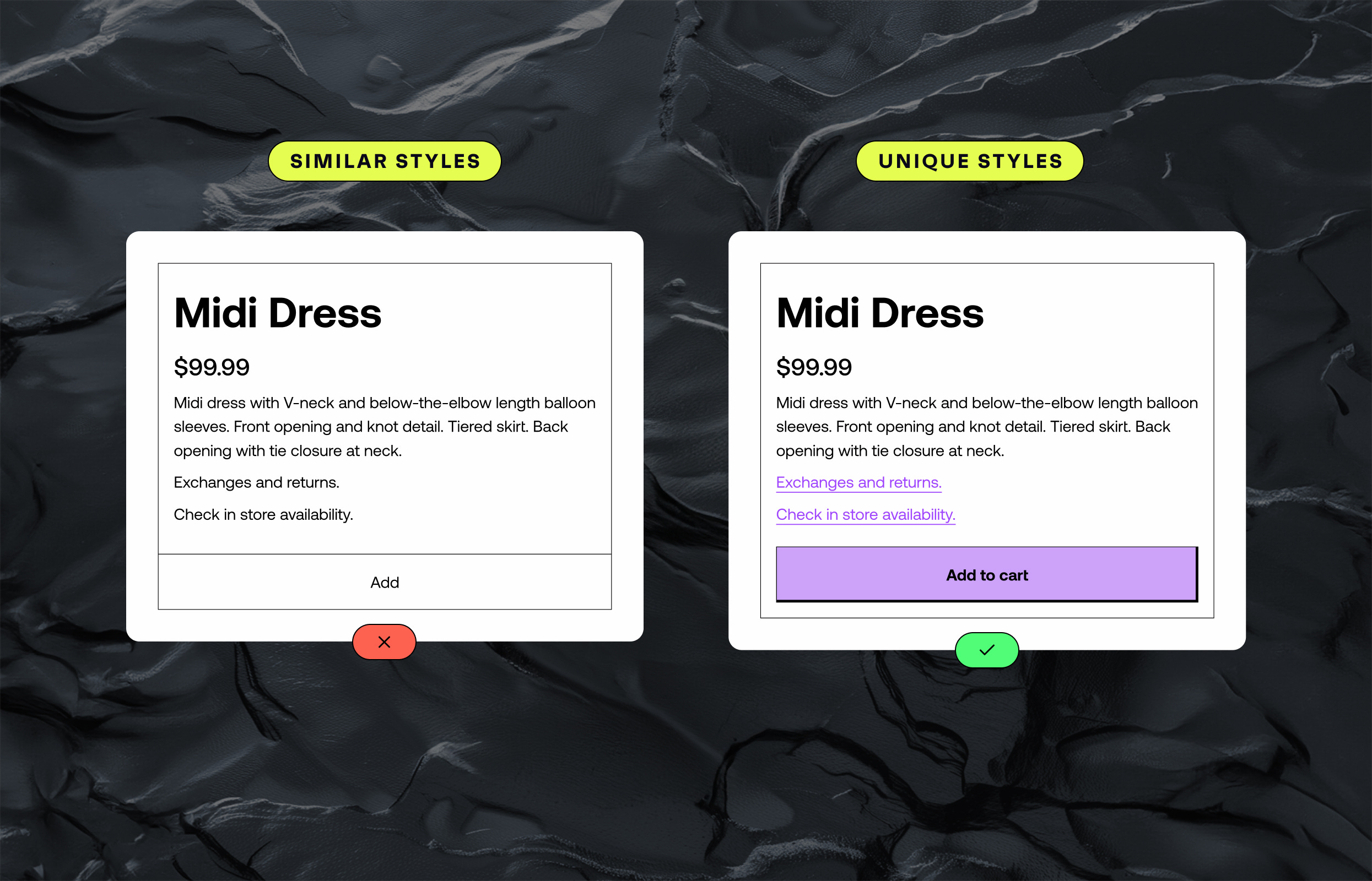
3. Clearly Distinguish Interactive Elements
Don’t make people guess what’s interactive and what’s not. Use unique colours and stylings for anything that’s a button or an input. The more obvious you make it, the easier you make life for everyone using your site. Your most important actions should stand out like a sore thumb.
(For what NOT to do, you can always check out the Zara website)
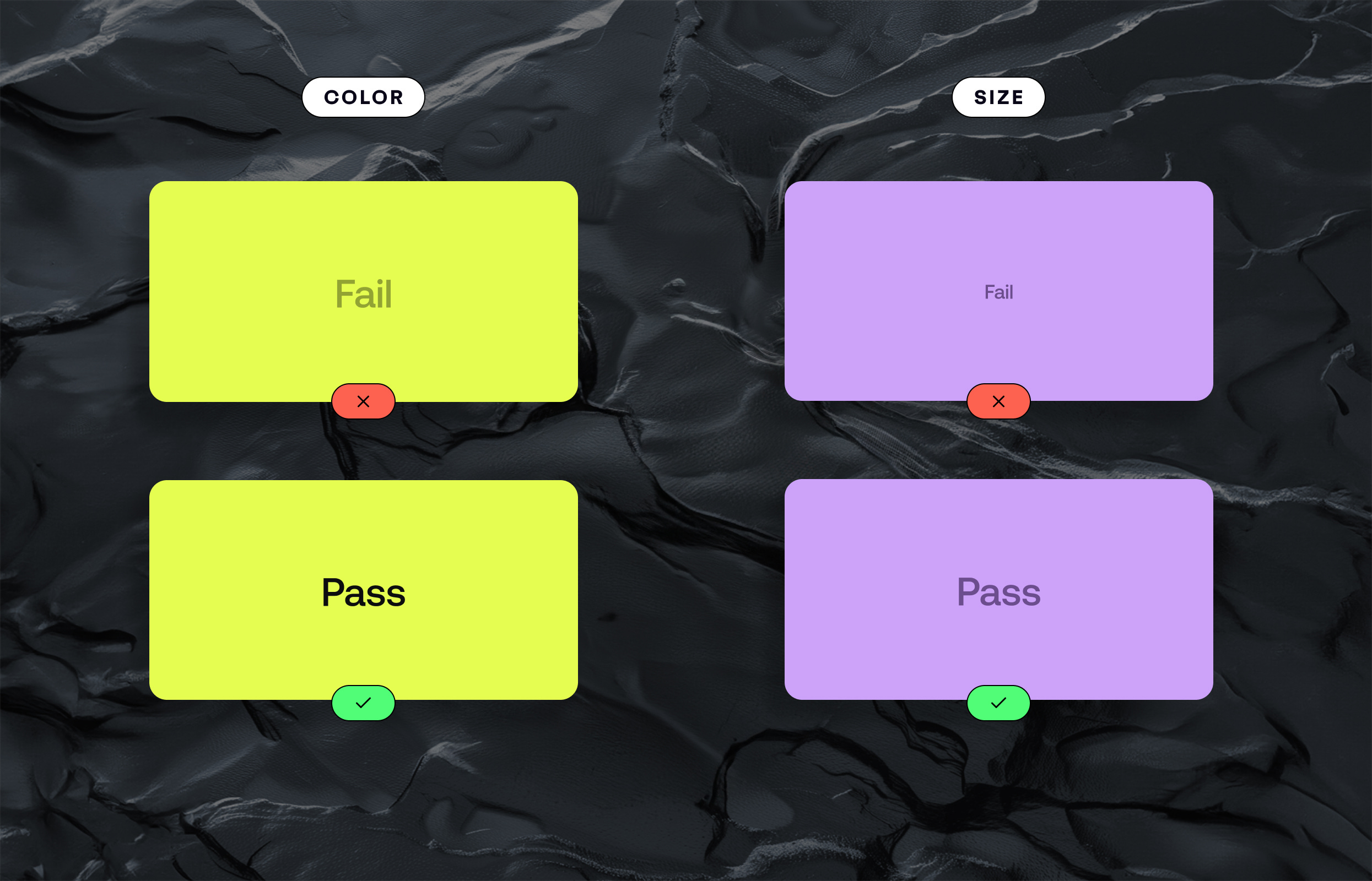
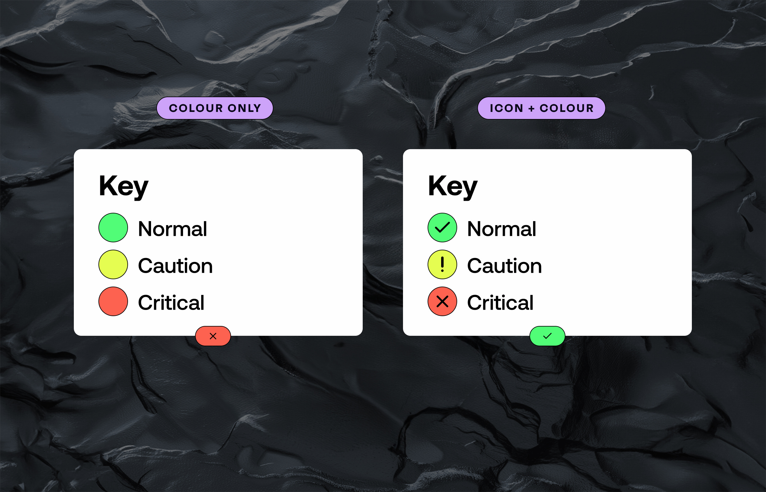
4. Never Use Colour As The Only Indicator
Don’t make colour an essential information layer. Always back up colour with text, icons, or patterns. A good example? Underlining links. Colour can help them stand out, but underlining it ensures everyone knows it’s clickable. Even those with colour vision deficiencies.
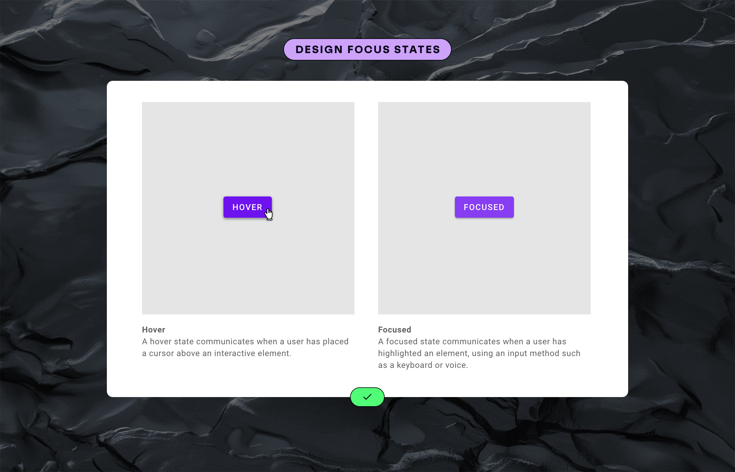
5. Add Focus Styles
Don’t confine site use to those with a mouse. When someone navigates your site with a keyboard, focus styles help them see where they are. Adding a clear and unique style to your focused elements makes your site instantly more accessible to those who can’t or don’t use a mouse. This is one of those often-hidden features that’s invaluable when needed.
In the design industry, we often praise the beautiful, the whacky, and the innovative. Very rarely do we celebrate the important and overlooked aspects of design.
Nobody is going to hand you an award for making your site accessible. Most of your customers won’t notice. They’ll simply breeze through your site never realising you’d done anything different.
I guess that’s why people often say that good design is invisible.
But for others, these small adjustments mean the difference between feeling excluded, and feeling like they belong.
And while these changes might not show up on any business dashboard, that doesn’t make them less important.
Business doesn’t always have to be about metrics.
Sometimes it’s about doing what’s right.
Did I miss anything important? Let me know in the comments below!