
Solving Billion-Dollar Problems At Lululemon Through Observational User Research.
It's like stalking shoppers, only legal.
Click.
Click click.
Click.
I get paid to watch people click buttons on the internet.
Participant SarahLoves60 is tapping “Add To Cart” on Lululemon’s newly launched UK website over and over. We’ll just call her Sarah.
I’ve spent about three hours watching people like Sarah try and buy a pair of leggings online.
Sarah is having serious problems.
I’m delighted!
What I’ve just uncovered will be game changing. The stuff User Researcher dreams are made of.
A serious, yet easily-fixable pain point.
“I guess this product is sold out. I’ll try another one” - Sarah says to Big Brother.
She knows I’m watching. Not me, specifically. But someone.
(We’re not actually talking live - this is a recording.)
Sarah is literally being paid to shop online.
I thought I had a fun job, but these people have it dialled in, amiright? Even if it does sound a little creepy when I describe the set up.
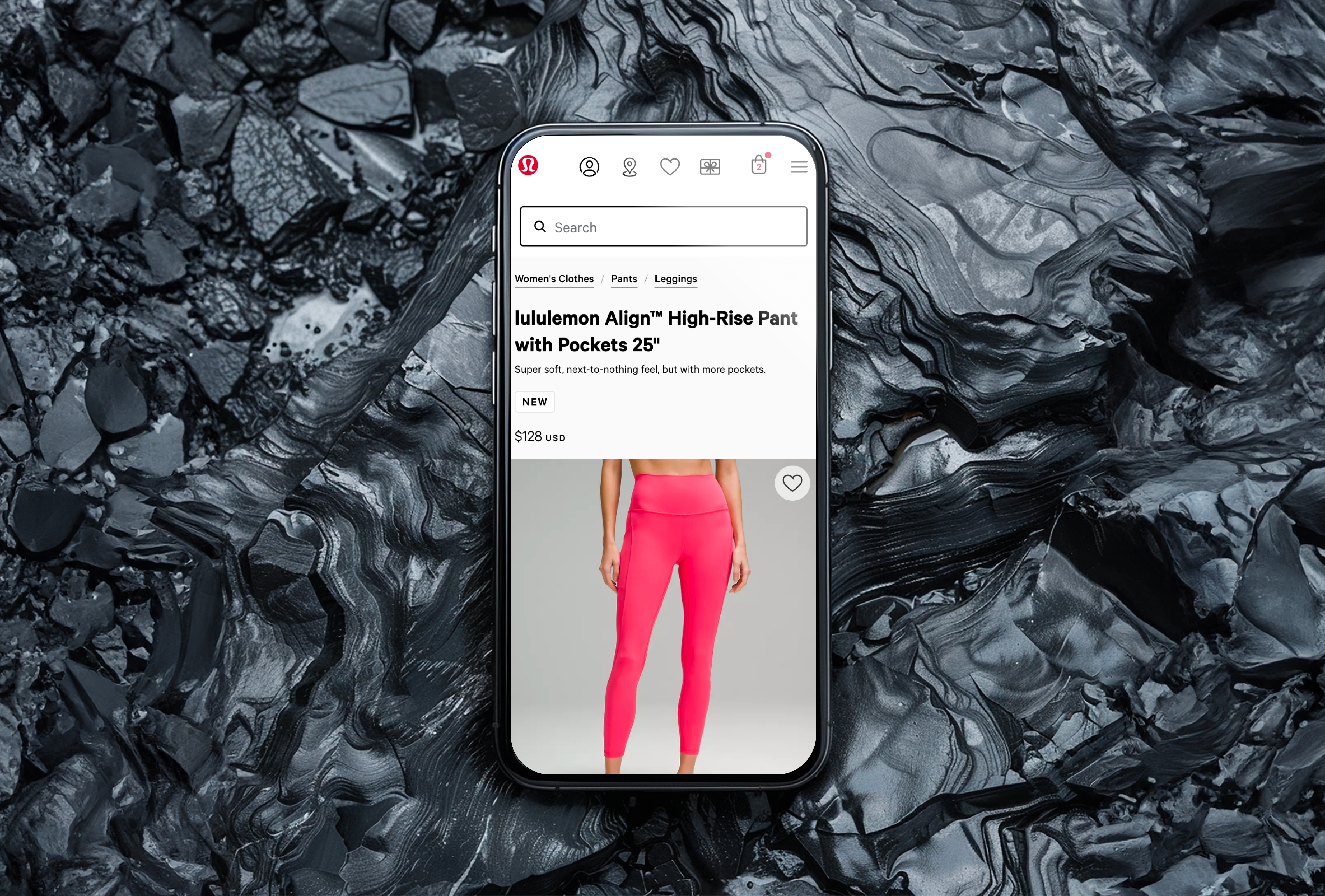
She finds another pair. The infamous Lululemon Align Pant. High Waisted. Oof. Yes please.
The turquoise looks good. The forest green too.
Of course, in the end they choose black.
Everybody always chooses black. (Well, 90% of them)
Sarah clicks “Add To Cart” again.
…
Nothing.
“I guess this product is sold out too? I’ll try one more?”
Maybe the Fast and Free High Rise 25”?
Click.
…
Nope. Nothing.
It’s amazing they haven’t just given up by now.
This site clearly isn’t working.
One of the most basic curiosities about humans using software is that they’re great at making excuses for why the software doesn’t work the way it’s supposed to.
“…It must be sold out…”
“…I must have tapped the wrong button…”
“…I probably typed it in wrong…”
They often think the problems are their own fault.
It almost never is.
I promise you, curious reader, that next time you’re feeling stupid using a piece of technology, it’s not your fault.
If it’s anyone’s fault, it’s the fault of people like me - the software designers fault.
Despite this, Lululemon customers are a tenacious breed known to persevere even in the most uninhabitable of online shops.
I’ve watched people attempt to check out seven times in a row to purchase a pair of leggings. Sometimes bad design can stop no man.
A sub-standard ecommerce replatforming
The truth is, none of the products Sarah clicked on were sold out.
Every single one of them could have been purchased, if the customer had only been given the right feedback.
Lululemon’s International arm had just completely re-platformed their UK store. A totally new back-end architecture, front-end framework, and freshly designed user interface.
Red buttons instead of green. Rounded instead of square. Etc.
They’d rushed the launch and knowingly put out a sub-par product to get to market faster.
Short-term solutions for long-term strategies.
On the plus side, they could deploy new stores in new territories with new currencies and new languages faster than ever.
On the flip side, their conversion rate had tanked.
Really tanked.
It was under 1 percent. Not great for one of the most successful brands in the world, in an industry that averages a little over 3%.
This was the first time that I’d seen this happen for an online retailer after a relaunch. It wasn’t the last.
The power of observational user research
One of the most effective ways to diagnose the problems of any system is simply to watch people using it.
So after Lululemon asked me to help fix things, I booted up UserTesting.com and set up an experiment to get twelve UK shoppers to try and buy an outfit.
Pretty soon some major problems were staring me in the face.
The UK Store for Lululemon was violating item 1 of the Nielsen 10 Usability Heuristics for User Interface Design: Visibility of System Status.
“The design should always keep users informed about what is going on, through appropriate feedback within a reasonable amount of time.”
These items weren’t sold out.
The add to cart button was working as intended.
The customers simply hadn’t chosen a size.
The smart thing to do in this scenario would be to alert the customer.
Instead, the platform just gave them the silent treatment.
Click...
…Nothing.
It was the kind of problem that, if I was working with a startup, we’d be solving within the week. But Lululemon is a billion-dollar athleisure behemoth, and internal processes move at a more glacial pace.
Research…documentation…stakeholder buy-in…resource allocation…planning…design…execution...
Mere weeks later, JIRA tickets were being allocated to the offshore team to build the fix.
Six months later, conversion rates were up 83%, and the International division would go on to have their most profitable quarter to date.
I was delighted
The team was delighted.
You know who was even more delighted?
The customers who could finally purchase their gorgeous pair of sweat-wicking, downy-soft, reassuringly-premium-priced, any-color-as-long-as-its-black, yoga-inspired, Lululemon leggings.
Amen to that.
Learning and fun at the same time? You're spoiling us readers!