The Hidden $380,000 Cost of Copying Your Competitors.
Why it can pay extremely well to do the opposite of other DTC brands.
“What do you think Ian? It seems like a no-brainer.”
Oof.
I’ve heard that before.
I’m discussing the weekly design priorities with the CEO of a growing fashion brand from California. They do about $7 million in revenue each year and have aspirations for a lot more. Everything they make is one-of-a-kind, which creates one-of-a-kind problems for selling online that most brands don’t have to deal with.
He’s scrolling through the site of his biggest rival, a European brand that makes a similar kind of product, while making around 5X the revenue.
This competitor's website markets their product range using high-density grids with no product information. A mass of product photos that customers can quickly scan.
“We should definitely try this.” he says.
“This is a big change to how you merchandise. I really think we should test this.” I respond.
I don’t think he’s wrong. In fact, I want to prove he’s right.
He’s not convinced.
This is a common reaction to brands new to the design experimentation process.
CEO’s are used to going with their gut instinct. And his gut is telling him to make the change and move on. Here I am telling him to slow down, gather some data, and use that to identify the right approach.
Thank goodness I talked him off the ledge.
A week later we’re passing over the designs to the developer. He’s responsible for building the A/B/C test. Once it’s live, different customers will be randomly assigned to experience different version of the site. One third seeing version A, one third version B, and the rest version C.
We hit launch…and then we wait.
This is the hardest part of testing.
The waiting.
If you don’t let enough traffic run through your tests, the data can be unreliable. We’ll let almost 57,000 people participate in this particular experiment. Almost 19,000 visitors per variant. It was three weeks before we had the confidence level we were looking for on this specific test.
That no-brainer idea?
15% lower conversion than the current site.
“Oof” indeed.
But that isn’t the end of this particular story.
You see, I’m not one to turn down an opportunity to do the opposite of what my clients want. That’s why three weeks earlier, when I designed the test, I ensured we went in two different directions.
One just like our competitors were doing.
One the complete opposite.
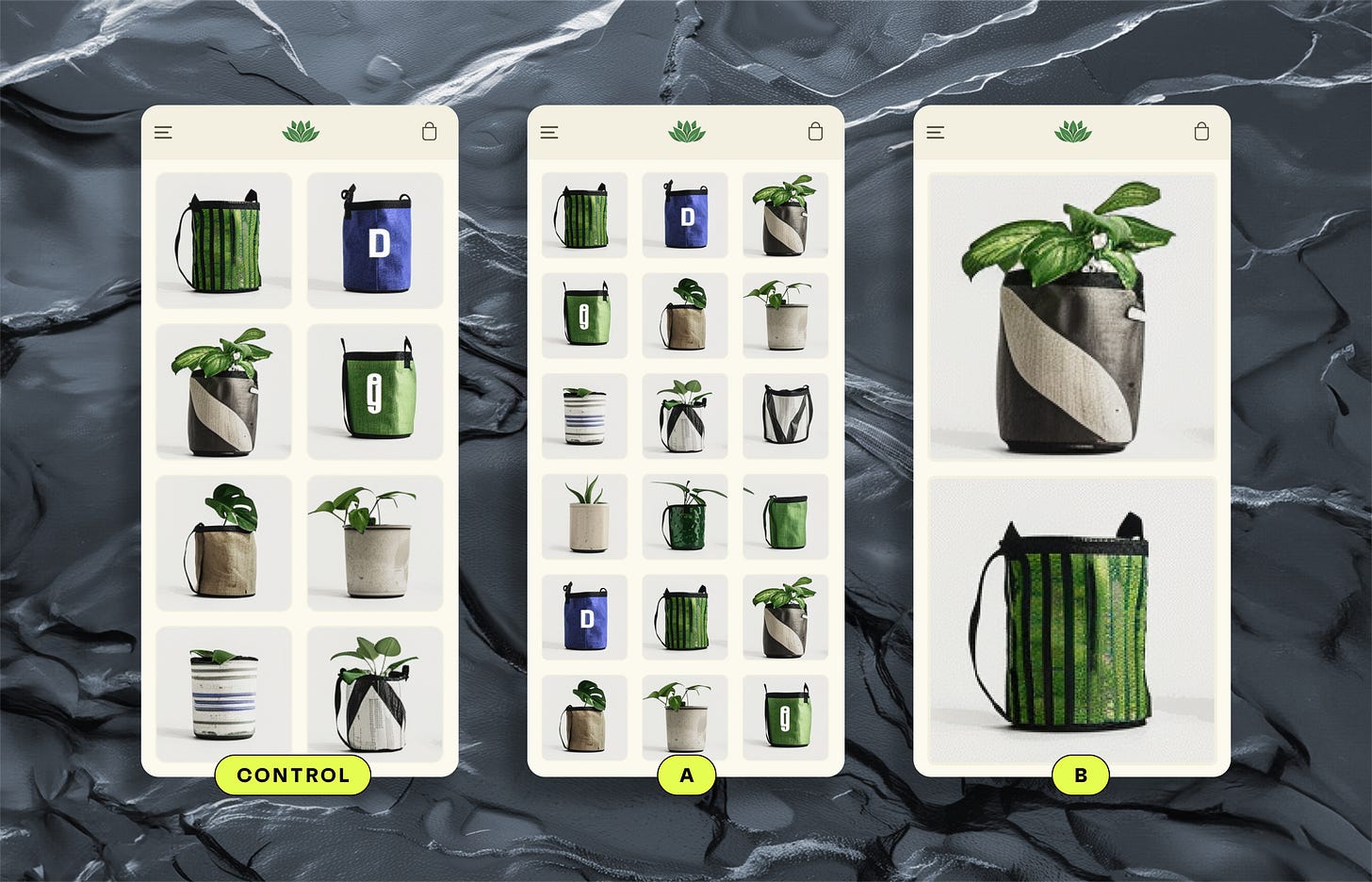
Three versions were launched:
The Control. The current site with a 2-column grid
Variant A. Smaller thumbnails in a 3-column grid.
Variant B. Larger images in a single-column grid.
The outcome?
A 12.7% increase in conversion from Variant B.
An expected annual increase in revenue of $380,000.
The truth is, competitor brands can be a great source of inspiration for ideas. But the existence of an idea in the world isn’t proof that it’s a good one.
Sometimes when they zig, it’s better to zag.
380,000 dollars better in fact.
The potential annual cost if we had implemented that no-brainer idea?
Nearer to half a million dollars.
Many brands don’t believe in the value of testing when I first start working with them.
I spend a lot of time repeating my mantra “I think we should test that”.
Once they witness a result like this, it’s me who gets to be the one listening to the words
“I think we should test this.”
Music to my ears.


A gem. Love it....but now I'm wondering ... did you split test this blog post too? ;)